Thursday, 8 May 2014
I finally set up my Facebook photography page!
After so long of people asking if I have somewhere they can see me work and friends wanting me to set one up I have FINALLY set up my photography page! Although it is only a Facebook page, after I have finished this year of Uni I will be setting up a Flickr account and maybe a Tumblr and putting my work on there to try and get my photos into more areas of the internet. I am also hoping to start my own blog (separate from this one) and maybe a YouTube channel showing shoot set ups and videos of days out with groups I shoot for such as Shropshire Lanes ( and off-roading group I work with, I will be doing a blog entry about at some point). My only concern in having my work public is the possibility of people removing my watermark and claiming the work as their own or the images being used without giving me credit, but I am planning to make my watermark larger so it is hard to edit out in hopes this will prevent the images being stolen....
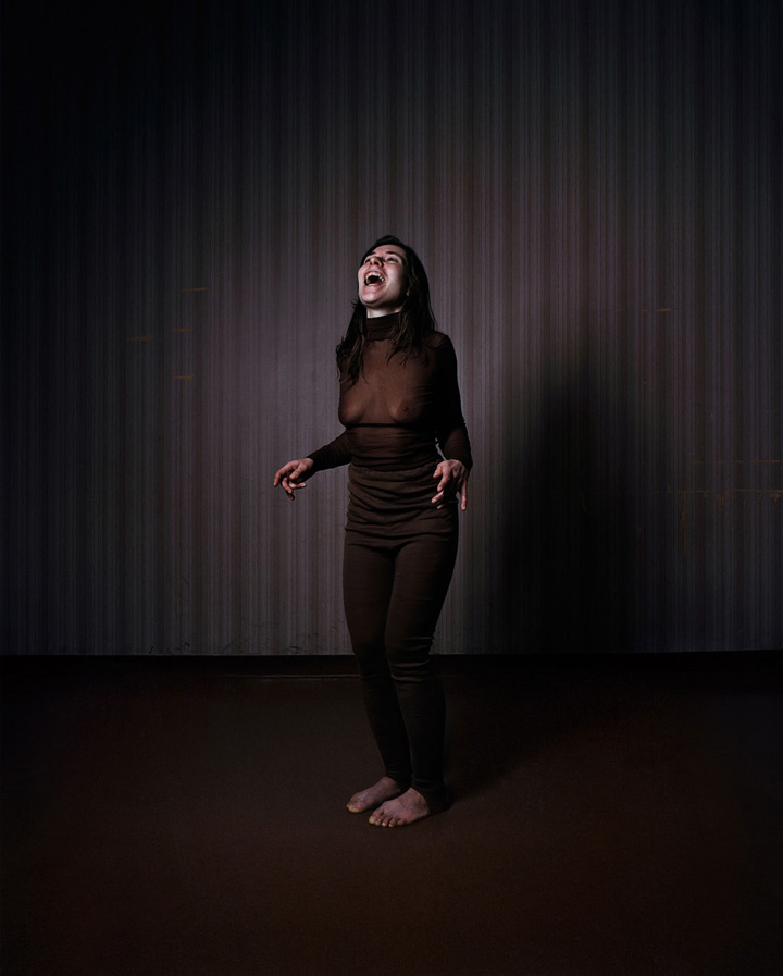
Anna Linderstam
Anna Linderstam creates silent dramas. In constructed environments performative action is condensed into emotionally charged scenarios within photography and video. The work aims to capture the elusive process of "becoming" whilst simultaneously highlighting the subject's act of "giving oneself over" to the photographic gaze. -http://www.christianlarsen.se/artists/anna-linderstam/
To me these photos are a combination of performance and documentation, as said in the quote above, she creates silent dramas which have been photographed in environments that look like stages. The photos have been taken when the subject have been standing up for too long, at the time when they can not longer stand. I find this to be very painful visually, the second photo I find quite disturbing and uncomfortable as it feels that the woman is almost becoming hysterical and that is not something I really want to see when I am helpless and can do nothing to help her.


Second Year Site Exhibition Review
The Second Year exhibition that I have chosen to review is the
Ignorance is Strength
exhibition by
Daniel Bubur, Nicole Gropetis, Michaela Howe, Bira Stoddart and Matthew Thompson
It was held upstairs in Waterstones Cafe and was inspired from George Orwell's 1981 Big Brother is Watching.When I walked up the stairs the first things that I saw were several of these posters running along the wall....


When I first saw these the only thing that really came to mind was the TV show Big Brother because of the environment and living weeks of constantly being watched by "Big Brother". But when thinking of that being the meaning behind these posters, it would only apply to the poster on the right because "Big Brother" never has a face, just eyes.After I got to the top of the stairs, on my right was this....


When I first saw these the only thing that really came to mind was the TV show Big Brother because of the environment and living weeks of constantly being watched by "Big Brother". But when thinking of that being the meaning behind these posters, it would only apply to the poster on the right because "Big Brother" never has a face, just eyes.After I got to the top of the stairs, on my right was this....
Every piece of paper said "we are the dead". While still thinking about the Big Brother Idea, I felt that by saying that we are the dead could be calling us zombies, calling us mindless and going along with the crowd....maybe?....or maybe I am reaching.
(Unfortunately while taking a break from writing this post the other photos that I took were deleted from the memory card they were on)
The main parts of the exhibition, besides the pile of notes on the floor, were a bunch of televisions in two big piles on opposites ends of the room with videos playing with talking and eyes on the screen. At the time I did not really understand what was going on in the exhibition and think that if I had more knowledge about George Orwell I would of understood it and enjoyed it more.
I really loved the location for the exhibition, something I really love about Swansea are all of the buildings and rooms that are above stores, I like that there is such a beautiful place above a book store where students can exhibit there work. I also like the fact that people that would walk into Waterstones and see that they could go upstairs to a place they normally wouldn't be able to go and see art.
When it comes for us to do our exhibitions I really hope that Waterstones will be available.
Video Clip
I did not attend the session where we showed a video clip to the class. But when it came to doing a blog entry about it I did have one that I wanted to show. The clip I have chosen is a short 'teaser trailer' for an album by Ghost in the Addict. This is a musician I discovered online and have been a huge fan of for a while now. I have a strong attachment to his music when I am not well. His first album; Wishblister is what made me fall in love with the music and the style of music he makes. I found this video when I bought the album, as well as the music he included the video, but I then found it on YouTube as well as a Part One...
The video shows mainly him using his blood in creating the title and front cover for the album, I guess showing how he literally puts himself into his music. The reason I have chosen this clip is because blood and blood art are, although strange to some, things I adore and his commitment to his work makes me feel inspired to be more committed to mine. In a previous project I developed a somewhat strange obsession with syringes. I love the fact he is using on as his instrument to create art. When I am in a bad way or not well I always find this music to numb my mood or match it, it is everything that I need to hear at most times and when I really get into the darker things in my life that inspire me this music puts me in the mood to develop them more.
The pain he is inflicting on himself for his work, whether it is using the pain in his life as a inspiration for his music or the syringe in his arm to create art, it is something we end up doing in our own work, we touch back on those painful memories, we push our body to extreme lengths sometimes to get what we need for the things we create.
The constantly switching between clarity and blurring to me shows difficulty focusing and keeping your mind in a certain way, constantly switching back to an unclear mind set and then being able to focus again. The switching between the work at hand, the walls and lights around the room and then to his body again goes with the idea of finding it difficult to focus, there are so many things running through the mind, switching and changing without warning.
For a few seconds in the background there is a shot of a bunch of empty photo frames, this is something I would like to do a photograph on. After looking at it for a few seconds I knew what type of photo I will be able to do based around this idea and will hopefully do at some point in the future when doing personal work.
This is Part One of the trailer....
Wednesday, 7 May 2014
Marina Abramović

To me this photo is a brave and very cringe worthy photo. Assuming that the scorpion is alive of course. At any second it could sting her, and the pain of that alone would be bad enough but having it on her face knowing that it could potentially blind her is what makes the photo worse. She is a performance photographer and from this photo I feel that her aim to get a shock worthy reaction from the viewer/audience. I think the black and white element of the photo is to perhaps represent that it's a very strong photo that is on edge, the black and white make the contrast of the scorpion against her skin much bolder. I really like that she has mimicked the shape of the scorpions pincers with her hair.
Peter Dench Artist Talk
I'm not normally interested in photojournalism
and Peter Dench’s style of work is nothing like my own so I probably wouldn't use him as artist research in my visual diary but when I went to his talk the main
thing that I wanted to take from it was knowledge about the industry and
succession in photography. He mentioned about Dench Diary which is a blog he
has where he writes about his work and projects that he is doing, this is
something he suggested doing and something that I have thought about doing when
I get my work online. I think it is a good way for fans or people that are
interested in your work can have more information about your thought process or
just how you are getting on with current work.
He said that ‘it is very important from
an early age to know where you are from and who you are’. I think this was
important to write down to try and remember. I agree with him a lot on this,
whether it is a good or a bad thing, knowing where you are from is a great way
to start your practice when it comes to personal work and will make you
understand more about yourself and who you are. It will help to sculpt your
work around the things you know best and things you have known for all of your
life.
He said that at 18 when looking though
a Martin Parr book, his eyes were opened to the fact that you don’t need to
travel so far away to get great photos. At the time of him saying this I was
thinking that the only way I would be able to get great photos is if I travelled
somewhere far away and new to me, that everything around me had already been
used and done and there wasn’t much left to see, but going back to his point
about knowing from an early age… I think that can be a good stepping stone to
staying where you know and using that as a way to make something new out of
thing that may be used and done.
The final thing that he said which I
really liked was ‘If you can disarm your audience with humour they expect what’s
coming next’ to prove this point he showed us a few photos which were quite
funny and then showed us something which was quite horrible which instantly
lowered the tone of the room. One thing that I have been worrying about with my
work is that the more grim and weird things I show, people will eventually get
bored or always expect me to top myself and when I can’t they will no longer
have an interest so maybe I should try and ‘disarm my audience’ somehow so they
don’t know what is going to come next, I just don’t really know how to do that
yet .
Thursday, 13 February 2014
Claire Curneen Visual Response
Claire Curneen Visual Response
I unfortunately I did not get the chance to go to Mission Gallery to view Claire Curneen's work but instead I read the information and viewed the photos of her work on the Misson Gallery website and created my visual response from that.
The sculptures that really caught my eye and gave me an instant idea of something I wanted to photograph were these...
 |
| Photo taken from http://www.missiongallery.co.uk/exhibitions/to-this-i-put-my-name/ |
 |
| Photo taken from http://www.missiongallery.co.uk/exhibitions/to-this-i-put-my-name/ |
I found that I could relate to this sculpture really well having a bad few moments of suffering recently, I found myself cradling my face in my hands and smearing my tears across my face and completely soaking my hands and face and it was because I was crying so much dealing with personal suffering.
 |
| Photo take from http://ferrincontemporary.com/wp-content/uploads/2013/05/curneen_Ferrincontemporary_2013_blue..jpg |
I wanted to try and recreate a combination of the sculptures so I found a close up image of the pattern of blue and gold that had been painted so I could use it in my own photo.

This is my visual response. I became really involved with the suffering and hands idea that I saw in Claire's work and wanted to do my own story I guess using her sculpture as part of it. My photo is the before moment, before every thing becomes too much. When tears only start to fall so they don't completely overwhelm. Using the drawing desire that I have had and the pattern that she uses I have tried to create something pretty out of a sad thing. I like the obvious blue for sadness and I want to gold to show something pretty.I was trying to make the body look paler to be similar the white body in the photo above but then I ended up having the arms and hands very pale which to me made the blue seem like it was draining the life out this person, and thinking in the terms of depression when a person goes through great suffering and misery, their life does get drained away and their bodies can become pale.
I really enjoyed doing this photo, I love being creative with photos and when I have to be some what artistic with the props or subject that is to be in my photo I'm really happy and considering how much I felt I could relate to the suffering I saw in Claire's work, I like the irony of of how much I enjoyed doing a response to it.
I really enjoyed doing this photo, I love being creative with photos and when I have to be some what artistic with the props or subject that is to be in my photo I'm really happy and considering how much I felt I could relate to the suffering I saw in Claire's work, I like the irony of of how much I enjoyed doing a response to it.
Subscribe to:
Comments (Atom)