Thursday, 8 May 2014

Esther Teichmann Artist Talk

I had never seen Esther Teichmann's work before, but after she showed us what she has done and told us about the projects that she wants to do I found myself really loving her work. I mainly loved her videos which at the time she said she had not released yet and after trying to find them online I guess she still has not released them yet. The video that I really loved was of a woman who was a dancer rolling around naked on a bed that had curtains on it, her movements and the enclosed bed were to represent the womb. The video went on for quiet while and had no sound (I think it was unedited) but the movements of the woman flowed so naturally and some of her movement were really flexible and unusual she did appear to be floating around in water. This video may have been to do with a project she had done called Mother and Lover, but I am not 100% sure of this.

I love every aspect of this photo, I love the really unusual, kind of not right vignette effect on the photo. It brings focus to a specific area in the photo and kind of looks and if the colour in that circle has in fact been washed away slightly. This photos bring to mind so many questions about the person in the photo, like why are they there, are they okay, are they safe and so on....

Like in a previous artist talk I tried to take away as much information I could from her about the industry and how to succeed and do well. She told us about how she had collaborated with a painter, so when I got back to halls I asked an artist and a illustrator if at some point they would want to do a collaboration together, both said yes. I had never thought about collaborations before but I think it is a good way of getting your name out there, a good way to meet new people in different areas of art which could then get you into different areas in art.


She told us that in her sketchbooks she tends to write down little stories and will based her work off them. This really appealed to me because this is something I like doing, I like creating my own little world and getting lost in it, but again I have never thought about combining it with my photography. For my current project I am looking into stories and escapism so this was the perfect time to be shown that using any element in your life can contribute to your photographic work. I am defiantly going to Use Esther as artist research in my visual diary. 

To me this photo is quite a fantasy style photo, the colours in the trees don't seem right, it looks as if the man is setting on some sort of random adventure into the forest, yet again bringing around a lot of questions of why. I think the paint running off the frame of the photo adds to the fantasy idea and the fact that she writes stories with her work already shows this combination of her fantasy mixing in and becoming involved with her reality, the paint is running from the world in the photo and bleeding into reality.

Andres Serrano


Andres Serrano is an American photographer and artist who has become notorious through his photos of corpses and his use of feces and bodily fluids in his work, notably his controversial work "Piss Christ", a red-tinged photograph of a crucifix submerged in a glass container of what was purported to be the artist's own urine.- http://en.wikipedia.org/wiki/Andres_Serrano

This is a photo that at I first glance I would like a lot, I think the colours of the photo are really nice, the textures across the image make the photos seem more than just a photo where the light has been edited, it give it more depth. But even while writing I feel uncomfortable saying that I like the photo because it is a photo of urine.


File:Piss Christ by Serrano Andres (1987).jpg

7 Simple Photography Hacks


I came across this video while looking at articles on http://fstoppers.com/. I love videos like this because there are no long winded explanations, simple little tricks to try out and each different hack only takes up a few seconds.

I think some of the hacks could be quite useful like the string tripod.... it's so much less space than a tripod and you can carry around the right amount of string in your camera bag so you can always have something to steady yourself.

I though the Vaseline hack was brilliant! Rather than adding in blurred effects afterwards you can just carry a pocket size tub of Vaseline, like you might anyway, and just slip a filter into the camera bag and you have a brilliant photo effect at hand with little fuss.


Trying out the hacks.....
The first one that I tried out was the Vaseline hack, I don't have a filter but I though I would try it with cling film, that way you don't have to spend a while trying to clean the filter because you can just throw away the cling film afterwards.

Cling filmed camera with a hair bobble holding the cling film in place.


Vaseline....


I wanted to make sure that even thought there was something over the camera lens the image would still be clear, when I took the image on the right it was slight misty so I tightened the cling film as much as I could and wiped it slightly and tried again.


Maybe it was the sunlight from the blind behind but when I took the photo on the left I found the image much clearer and knew that using cling film rather than a lens would be okay to do.


This is my before photo of my subject before I put Vaseline on...
This was the first photo that I took with the Vaseline one and I think it was the best, there isn't too much blur, the rabbit is framed well and overall its not a bad photo.


The rest of the photos are just me carrying on practising with the Vaseline, I think I would be able to use this as a technique in my photos at some point, I think in certain themed photos this technique would be really good but it is just getting used to how much blur you want in the photo and getting your subject framed properly. 


I don't really like this photo but I like the effect that the Vaseline has on the cats right ear.
I like the look of it fading/ being blurred away.


I used blue and purple pen to colour the cling film and then ripped it like in the video, yet again attaching it to the camera with a band.


Although these photos did not turn out how I wanted them or thought they would I still like the effect that the cling film has given, I think I will have the practice a lot more with this technique in order to get it to work properly. Maybe I didn't use bold enough colours on the cling film? It has a vignette effect like the Vaseline but not a smooth, this kind of looks like broken glass....or maybe just plastic....

One overall problem I found using the cling film was  that if I had too much excess, when the wind blew it would get into the shot so I had to hold it down, but to prevent that I would just have to cut off the excess and it would be fine. 

The next time that I test these methods I will use a person as my subject, the animals were difficult to work with and it was hard trying to get them to stand still while I changed the focus and moved the cling film out of shot.


Rowan; "Photos don't change the world the way we want them to"

During a lecture Rowan said "Photos don't change the world the way we want them to". I wrote this down in my book and circled it to make sure I would write a blog post about it.

Before I started taking an interest in photography I want to do something with my life that changed things for the good, I wasn't really sure what or how I was going to do that but I know that there are so many things in the world that need to be changed and I wanted to try and do it, not all of it but just some things that could maybe make a difference. When I started going down the route of photography I still wanted to try and make some sort of a change for the good and maybe it was me being young, I thought that maybe through photography I would be able to make a change. When Rowan said this I knew it was true but I felt a little disheartened. Photos don't change the world the way we want them to. So many photojournalist come back with photos of war and famine, to begin with when these photos would make the news, people probably did want things to change, the photos they were looking at were horrible and they wanted to do something about it. But now we see so many of these photos from a day to day basis we have grown numb of it, we aren't shocked by what we see any more and even when we are it only lasts few a moment or at best a few days. So many worse photos are floating around on the internet of dead people, animal and child cruelty and more and the problem is we can't really do much about it. When we see a horrid photo we can think it as horrible and really wish we hadn't seen it and have the intention to want to stop it, but don't know where these photos have been taken or who has taken them, they are just random images. But as the internet continues to grow so vast everyday more and more things are uploaded and more and more people are seeing them, they are most likely just making us numb to the horrors in this world than giving the motivation to try and change the world.

Even thought Rowan is 100% right I think that we should not give up on trying to change the world with our art, out photos and our creations, we should just keep trying to find new and better ways to make a change.

Simon Norfolk /Late Photography

I normally tend to favour photos that are quite visually pleasing, if you have to know the story or meaning behind a photo I normally don't like it that much. That was until I was shown Simon Normfolk's;  Staircase at Auschwitz, with worn footsteps....


I did like the photo when I first saw it, I just thought that it was a bit creepy. I then found out the name of the photo and the whole photo came to life for me. I was right, it was creepy. 'Worn footsteps'.... you can very clearly see in the photograph  the two rows of dents that run either side of the stairs where people would of be walking to their deaths, all I could think about was how many people would have walked up those stairs, a lot to cause the dents, I wonder how many people only walked on way up those steps and never back....a whole history of pain and suffering had just be put on front of me in one photo and it was so powerful.

SImon Norfolk documents places that have been effected by war, his style of photography is known as Late Photography. Late photography are photos of places that tend have had huge histories, normally bad ones, such as war and 9/11.

Other photographs that he has taken showing these type of places are...

Bullet-scarred outdoor cinema at the Palace of Culture in the Karte Char district of Kabul
At a first glance the above photo just seems to be a wall that has started to eroded but you can see the gun shot line that runs up the wall and it makes you start to think about everything that happened here.

King Amanullah’s Victory Arch built to celebrate the 1919 winning of Independence from the British. Paghman, Kabul Province


Second Year Book Review

Second Year Book Review

The main book that I am going to review is (Man)nequin by Samantha Jones. I am choosing to review this book because I completely fell in love with it after seeing only a few of the photos and I really liked the physical aspects of the book.

The book is medium sized, hardback and almost square, it is pure white with black writing on the front with a matt feel but it slightly shiny which I really like. The typewriter style of font has a slight clinical feel which suits the style of book and goes well with the white background.

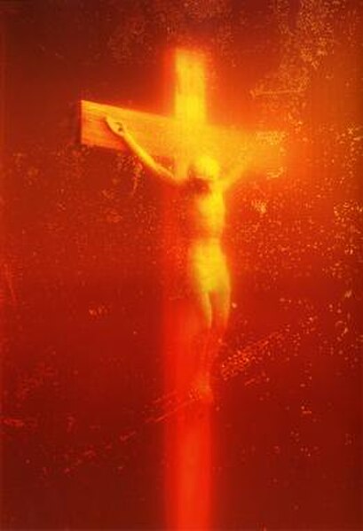
The first page when opening the book is this....


I like that there was a simple sentence when you first open the book to kind of prepare you and already give you an idea of what the book is going to be about so rather than looking at the photos and trying to see what they are about you are given a direct insight into what the photographer wants to portray. Also, I prefer this to having to read an essay in the beginning to some photographers books. After reading this sentence I felt that I would really like the photos mainly because I know that I project feelings of intimacy and loneliness onto things like teddy's and other objects. I felt like I was going to relate to the photographs in the book.

The photos were of a girl having what appear to be a close relationship with a mannequin which could represent the desire for a partner hence the bracketing of MAN in the word MANNEQUIN. There were quite a few photos, but not too many, I think a good amount, there was on photo to each double page, the photo was on the right page which I liked because I felt it was more comfortable to see a photo on the right hand page, I'm not really sure why but I felt it was more comfortable. The paper inside the book was a shiny paper which made the photos stand out and look really good and went along with the clinical feel of the front cover but I just didn't like the feel of it.

The content of the book and the feel of the photos has this almost psychological element to it. The white background and typewriter style font makes me feel as if it were an asylum doctors report or perhaps a psychiatrist report writing about the psychological factors and meaning to the attachment to inanimate object. Personally I really love that theme and assume it is intentional.


Although this was the first book I picked up, even after looking at others I felt this was definitely my favourite and I knew this would be the one I would review, I still made sure to think about the other books in a critical way, next year I will be making my own and I want it to be perfect and exactly how I want it so when  looking through and holding the books I thought about what I would want my work to look like in one so I wrote mini reviews on the aspects of the photos rather than the images....

What is Local is Often General- Daniel Babor
A fabric hard cover, I really like the feel, it looks good and very different, brilliant for grabbing attention and making you want to pick it up instead of other books. An opening paragraph and writing with each image which gives insight into the book as a whole and individual images  with the image on the right and the writing on the left. The matte paper feels really nice but I am unsure about how it looks, I don't know if I like it.

Tedu- Laura Corrys Thomas
A small square hardback book with a shiny but kind of matt front cover. I didn't like the page colour, having soft looking images against such a strong black background kinda of ruined the photos for me and made the pages seem to almost drown the photos. I think it would of been better if the images were on a paler colour, maybe not pure white but maybe a magnolia colour or something. But when I brought up this point, others thought it made the photos stand out more and it did look good, so I guess it depends on your preference, but personally I would not do this for my own book.

Salem- Alisha Williams
A smooth matt front cover that is hardback, inside were matt pages which I think for the style of photos was a good match, the images did not all sit in the same place on each page, they were in different places with different size photos, it worked for some images but not for others, maybe if the photos had borders around them? I think this was just a aspect of the book being made but the pages were quite tight together and I found it difficult to open the pages fully while trying to be careful with it.

Red Umbrella- Gloria Sandbrooke John
The main thing that I took from this book was the text about the book being at the end. I remember looking through and not really being a fan of the work but then when I got to the end and read the text, I wanted to go back and look over again with the information I just had. I think this is a good technique in getting the viewer to not just glance through your work because they don't really 'get it' but to look back through because when they come to the end they are given some insight and want to understand the photos.

Between the Lines- Rose Priest
I thought the quotation at the beginning of the book was good but over all there were way too many images that looked to alike and it was juts a bit boring and repetitive. As a book to sit down and look at I don't think it is that good, but the point of the book seemed to be to show repetition and that is what the book is so in the sense of the book being part of the work and the point of the work I think it works well.

Dreaming- Robert Paul Jones
A very large book but that suited the images well, if it had been a smaller scale I don't think it would have done the photos justice. The main thing that I really liked were the time and date stamps in each corner of the page. I felt that regardless of how distance you were form the imagery you could somehow relate by thinking what you were doing at this time and date and then think 'oh, well this I what the artist was doing' and it in a strange way makes you feel a bit more connected to the work, I'm not really sure why.


After looking so carefully and reviewing these books it has given me a great idea of the things that I will really need to think of when doing my own book  the font, font sizes, the feel of the book, size of the book, colour of the book and inside pages, the sizing of the images and so on.

One thing that I kept doing when looking through the book is imagining what my work would look like in a book, the main project that jumped to mind was my Foundation Diploma work The Darkness of Fairy Tales, because of how bold some of the photos were....

...This is the photo that I mainly had in mind when thinking of a booked version of my work, in this case I think having it on shiny paper would be much better than matt, I think matt paper for this photo would drain way the light and reflection in the apple and dull down the image. 

Of course when it comes to doing my actual book I will think more about the different aspects to suit the photos then.

They Live- OBEY

For ages I have seen people walking around with hoodies and hats saying OBEY on them, I literally saw them everywhere and just assumed it was some  brand everyone loved.

Thankful for the insight from Ryan and Rowan by showing us this clip from the movie They Live, I now know where the obey thing comes from and it’s really ironic....


In this clip it shows how everyone is ‘secretly’ being told to obey through advertising. People tend to like wearing branded clothing that have a brand logo or name very clearly on it, this is like free advertisement for that brand when people wear it, someone will be walking around with a name on and others will start to recognise and know the name therefore giving the brand publicity. The ironic thing that I found about people who were wearing the obey clothing (this may be a judgement and generalisation but in some cases true when they were asked) that these people do not actually know they are contributing to the idea we obey to advertising. They were wearing the clothing because it is popular. They are obeying to the advertisement the clothing has been displaying. They have obeyed…..